Safe brands feel polite. Bold brands feel inevitable. The difference is not volume, it is clarity of intent.
Why safe brands blend in
When everything is optimized for approval, the work loses edges. That erases memory.
- Generic layouts that look like every other template
- Copy that avoids a point of view
- Visual systems without contrast or hierarchy
Signals of boldness
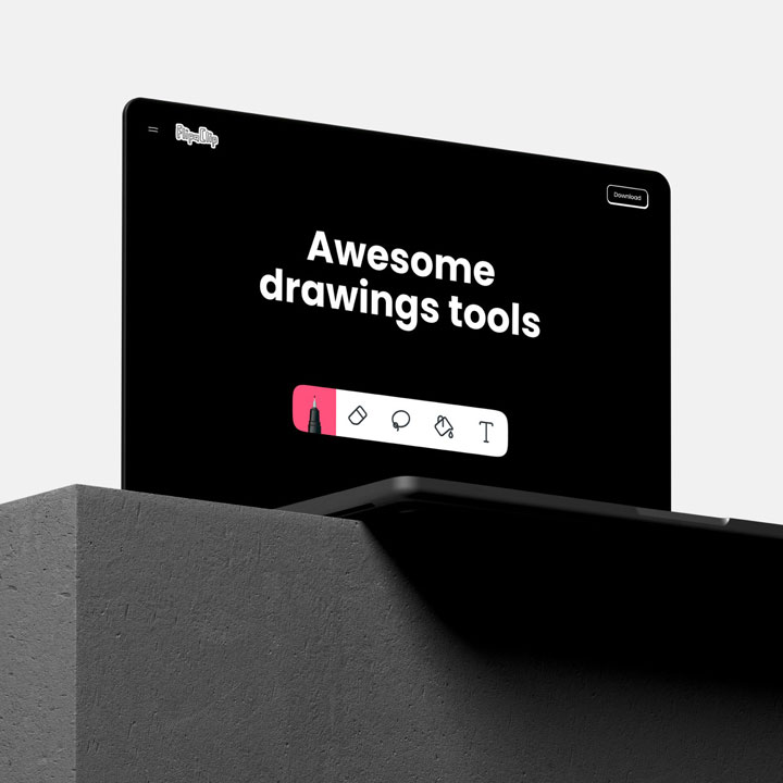
Boldness shows up in decisions you can point to: typography scale, layout contrast, and a distinct voice.
“Bold does not mean loud. It means clear.”
Key takeaways
- Make fewer, stronger choices and stand behind them
- Use contrast to create instant hierarchy
- Write copy with a specific point of view